UI design in mHealth Applications: Analysis of mHealth applications and creation of an online library
ABSTRACT
This Project focuses on analyzing mobile applications in the health sector, specifically examining their user interface design, usability, and user experience. A comprehensive evaluation was conducted on various health-related mobile applications using a Likert scale-based checklist. The applications were classified into different categories, and a web page, "Biblioteca mSalut," was developed to facilitate easy access and consultation of these applications. The results highlight that while many applications perform well in terms of compatibility, navigation, and design, there are significant areas for improvement in personalization and accessibility. The project also identified common design patterns and differences across applications, providing valuable insights for future development. The findings underscore the importance of user-centered design in increasing the adoption and effectiveness of mHealth applications.
OBJECTIVES
Analyze the usability, user interface and user experience of different mobile applications in the field of health:
Collect different mobile applications in the field of health and analyze the usability, user interface and user experience
through a checklist scored with the Likert scale.
Evaluating the user interface in mobile applications in the field of health:
Conduct critical user interface evaluations of a variety of healthcare mobile applications to identify common patterns and design differences.
Develop a library of health mobile applications classified as:
Create a library of mobile applications in the field of health classified by different types such as:
diegetic UI, 3D, 2D elements, serious games, specific diseases...
DEVELOPMENT OBJECTIVE 1
In order to evaluate the usability, user interface and user experience of the different applications, a checklist has been used to evaluate each application, this checklist is made up of different sections:
| Category | Questions | ||
|---|---|---|---|
| Ease of Navigation | Does the application have clear and consistent navigation? | Are the menus and buttons intuitive and easy to find? | Is there clear visual feedback when interacting with the application? |
| Design and Presentation | Is the application's design attractive and pleasant to the eye? | Is the typography and text size legible? | Is an appropriate and accessible color combination used? |
| Workflow | Is the registration and login process simple and fast? | Are the steps to complete tasks or actions well-defined and easy to follow? | Is the number of steps required to complete a task minimized? |
| Personalization | Does the application allow users to customize the experience according to their needs or preferences? | Is there an option to adjust settings such as notifications, language preferences, etc.? | |
| Feedback and Response | Does the application provide clear and timely feedback on user actions? | Are confirmation messages included after completing a task? | Are there visual indicators to show progress or the status of actions taken? |
| Accessibility | Does the application meet accessibility standards for users with visual, auditory, or motor disabilities? | Are accessibility options provided, such as adjustable text size, support for screen readers, etc.? | |
| Compatibility with Devices and Operating Systems | Is the application compatible with a wide range of mobile devices and operating systems? | Does it adapt properly to different screen sizes and resolutions? | |
| Security and Privacy | Does the application appropriately request and protect the user's personal and medical information? | Is clear information provided on how the user's data is used and protected? | |
| Updates and Technical Support | Does the application receive periodic updates to fix bugs and improve functionality? | Is there an effective technical support service to resolve problems or answer user questions? | |
| Ease of Learning | Is the application easy to understand and use for new users? | Is contextual help or tutorials provided to guide users through key features? |
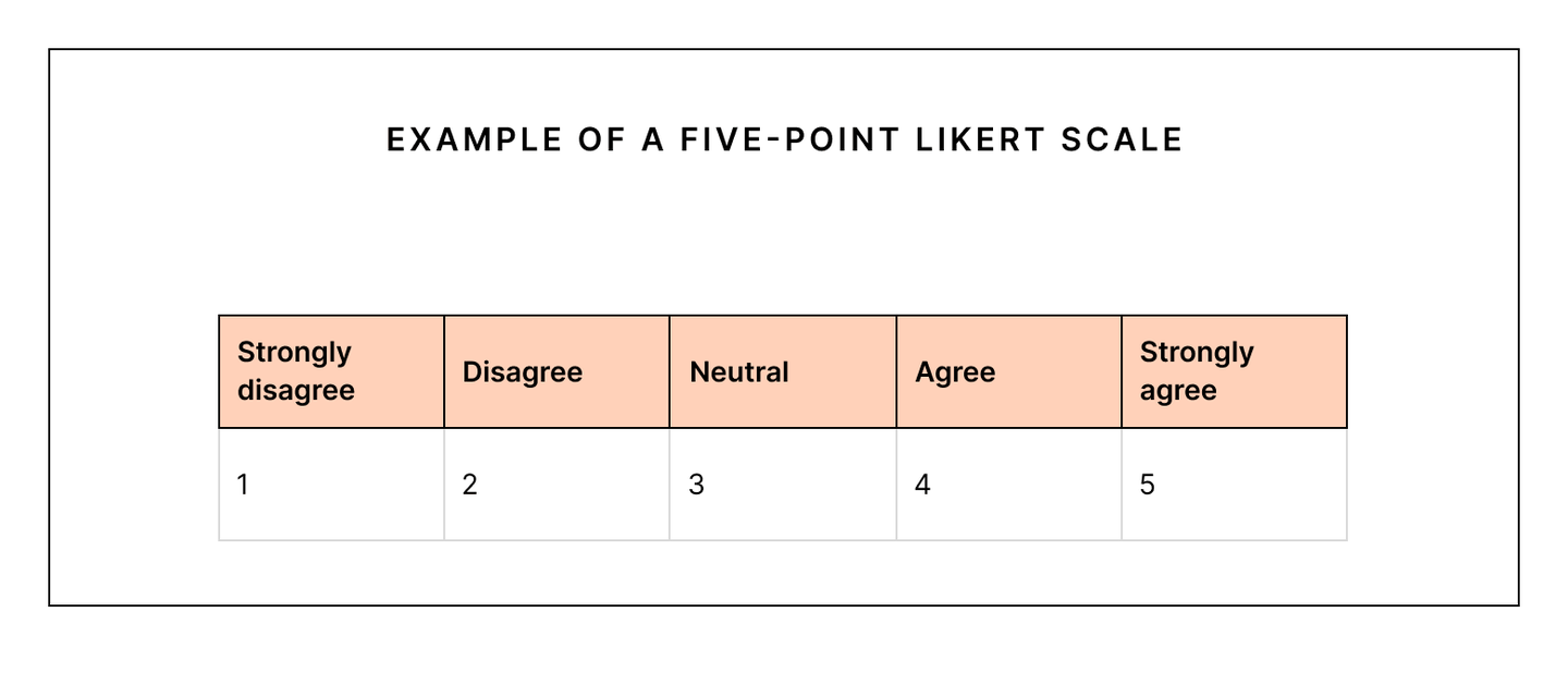
Each of these sections will be scored using the Likert scale. The Likert scale is a psychometric scale commonly used in social science research that employs questionnaires. It is the most commonly used approach to gradient ordering responses to survey research, the Likert scale format is 5-level, typically: 1. Strongly Disagree, 2. Disagree, 3. Neither neither agree nor disagree, 4. Agree, 5. Totally agree
I have drawn up an Excel table thus scoring each application according to the different sections mentioned above and scoring them with the Likert scale:
RESULTS OBJECTIVE 1
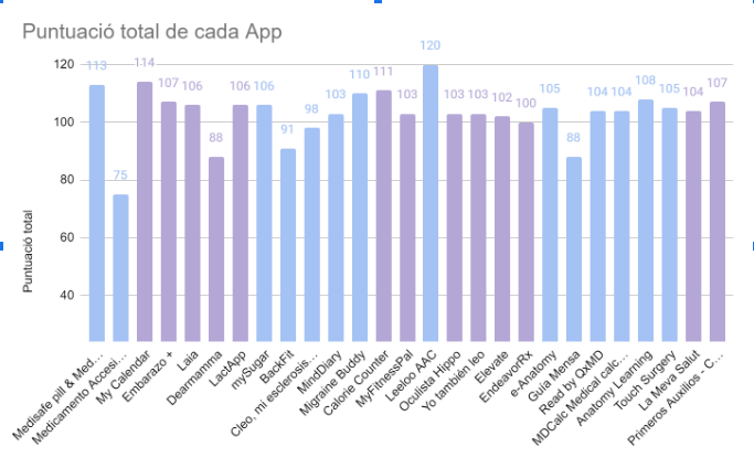
Scoring the applications in all the different fields, the maximum score an application can achieve is 120 (5 on the Likert scale x 24 questions) points and the minimum 24 (1 on the Likert scale x 24 questions) points.
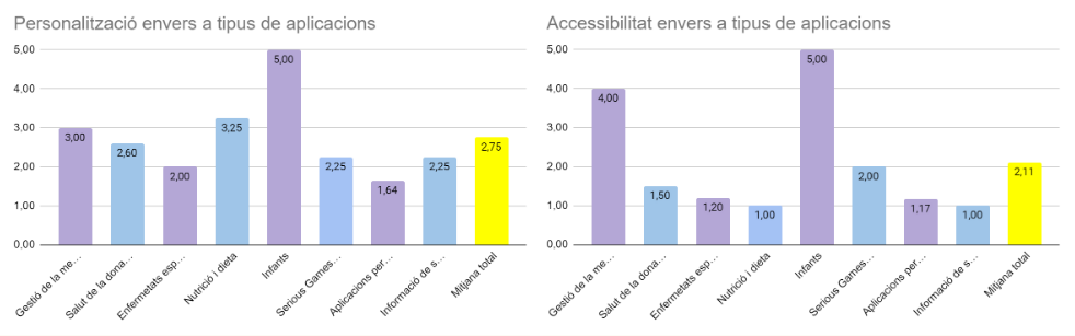
Going into more Specific results differentiated by sections, we can see how the total average of each section is around 4.27 points, we can also see that there are sections with serious problems: the Personalization and Accessibility section, with an average of 2 .75 points and 2.11 points respectively
DEVELOPMENT OBJECTIVE 2
In order to evaluate the user interface in mobile applications in the field of health, a dissection will be made of each application previously studied in the state of the art, identifying and separating the application into different sections and thus being able identify common patterns and design differences between different applications.
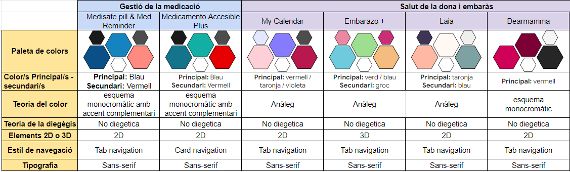
The different sections that will be studied in each application are:
Color palette, primary and secondary colors
Color theory
2D or 3D elements
Navigation style
typography
RESULTS OBJECTIVE 2
In general, color palettes with 6 colors are used.
The most used main color is blue and the secondary color is red.
The most used color schemes are the monochromatic scheme with complementary accent and the analogous Schemes.
Most applications use 2D elements, except for human anatomy applications that use 3D elements and models.
The most used navigation style is tab-navigation.
The most used typography style is Sans-serif.